Skip to content

Product design · Athens, Greece

Product designer building intuitive digital ecosystems.

Bridging cognitive psychology and front-end architecture to reduce mental friction.

Selected work

Why the interfaces look the way they do

Every screen spends the reader’s attention. Cognitive load theory says how much there is to spend, a mental model says where it goes, and the code decides whether the decision survives the build. Each principle is paired with the product where it made the call.

  1. Spend working memory on the task, not on the screen

    The mind

    Cognitive load theory separates the load a task carries from the load its presentation adds. Only the second is a design choice, and it is the one I cut first.

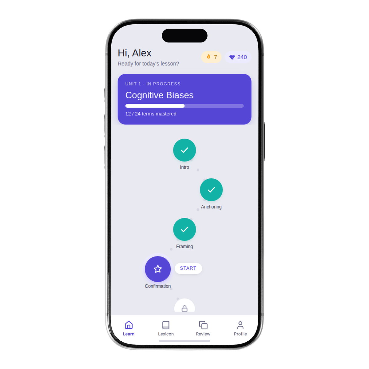
    The interface · Lepsychon

    Review shows one term at a time. Match-the-pairs was already designed and was deleted: with four pairs on screen the last falls out by elimination, so the screen measured sorting instead of recall.

    The build

    The scheduler takes one grade per answer. One term per screen is what makes that grade honest, so the interface and the data contract are the same decision.

  2. Borrow a mental model before building a new one

    The mind

    People read an unfamiliar screen through the nearest thing they already understand. Matching that model is almost free. Teaching a new one is the most expensive thing an interface can ask.

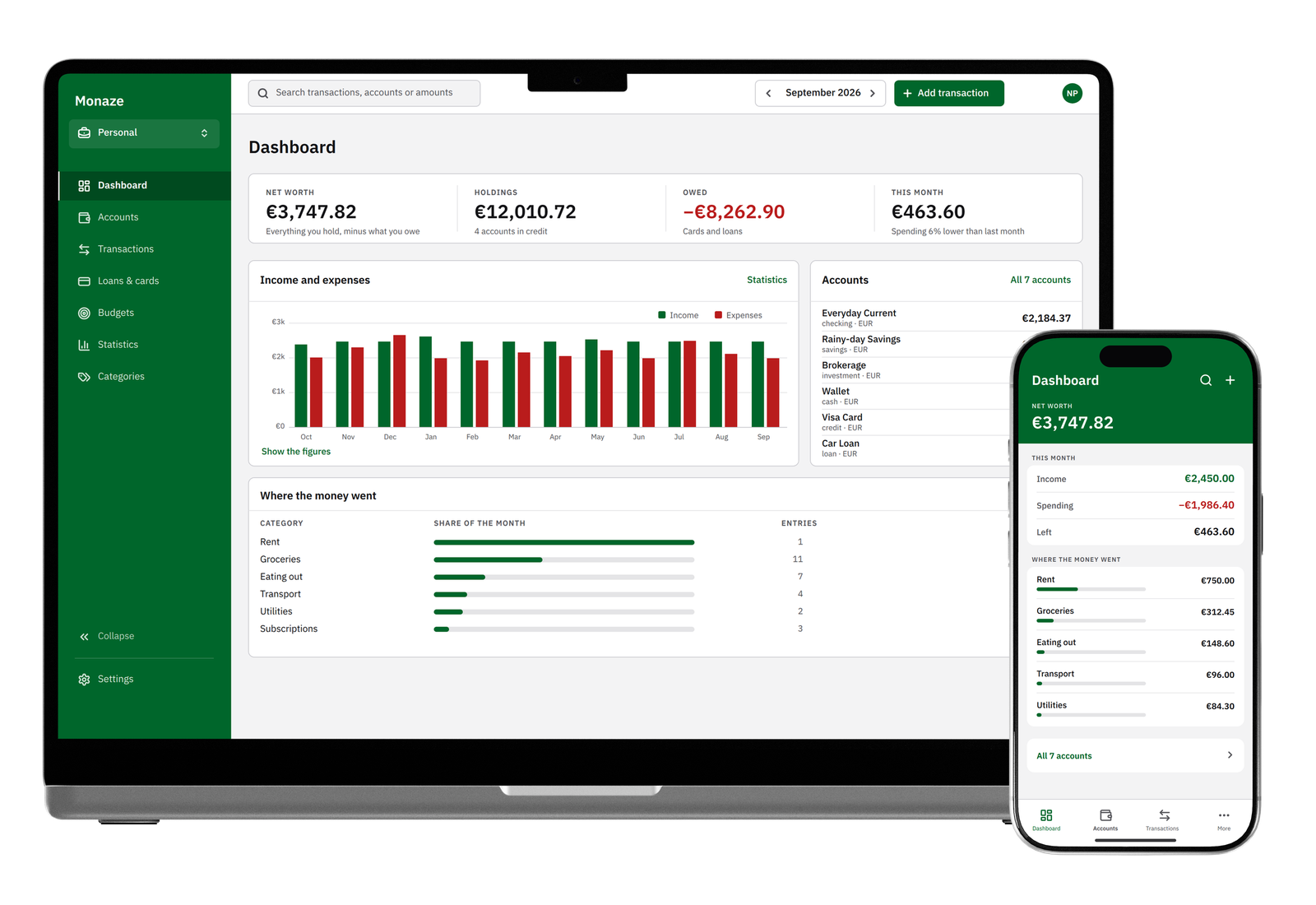
    The interface · Monaze Money

    The ledger borrows bookkeeping, a vocabulary its readers already own: a rail you work from, a sheet you work on, and every screen ending in one action that either balances or does not.

    The build

    A transfer is written as two linked rows, so every balance stays a plain sum of one account’s own rows. The model on screen is the model in the database, and neither has to explain the other.

  3. Never let meaning depend on a single sense

    The mind

    Perception is not uniform. Some readers never see the colour, and some hear the screen instead of seeing it. A state only one sense can read is a state some people never get.

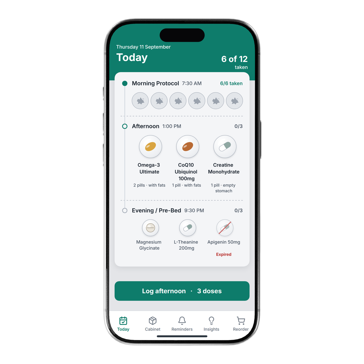
    The interface · BioSync

    The day is drawn as a blister card. A taken dose leaves an emptied cavity, so what is done and what is due reads from shape, before and without colour.

    The build

    An icon-only button cannot be constructed without an accessible name. The label is a required property, so the type system refuses the mistake before a review has to catch it.

The whole process, step by step, is on my approach.