Mobile product design · design system
Lepsychon
Product designer
A mobile app that teaches psychology through short lessons, flashcards and quizzes, backed by a free searchable lexicon. I designed the full product: information architecture, the design system's 30 screens per platform, and the token reference the build follows.
- Platform
- iOS 390×844 · Android 360×800
- Timeline
- 2026
- Status
- In build
Screens
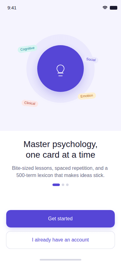
Onboarding: the value screen that opens the flow, ahead of the required sign-in and the first lesson. 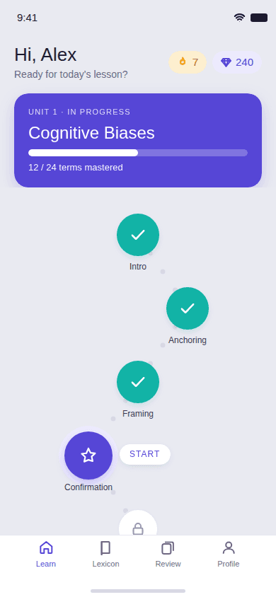
Learn path: unit progress, streak and gems, and the next lesson as the single primary action. 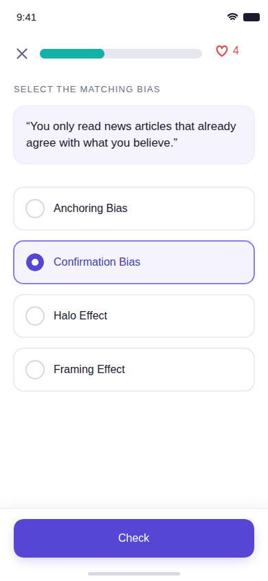
Lesson question: option cards at 62pt with distinct default, selected, correct and wrong states. 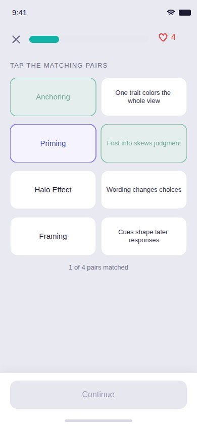
Review: one term at a time, the decision that replaced match-the-pairs. 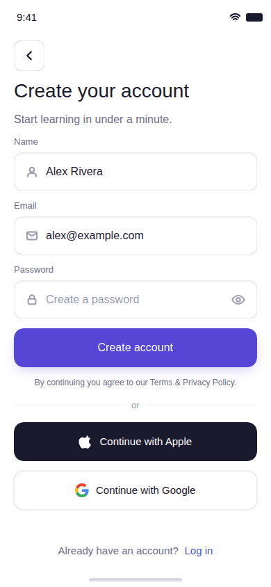
Sign up: the account screen, required before the first lesson now that sign-up is no longer deferred. 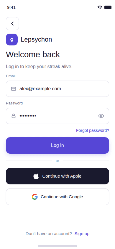
Login: labels above fields, never placeholder-only, with a show/hide control on the password. 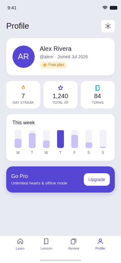
Profile: canvas background, 54pt list rows, destructive actions separated. 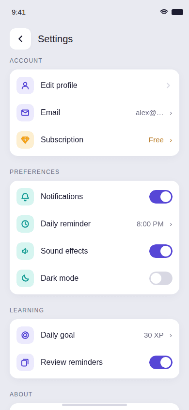
Settings: including the account deletion path required by App Store 5.1.1(v). 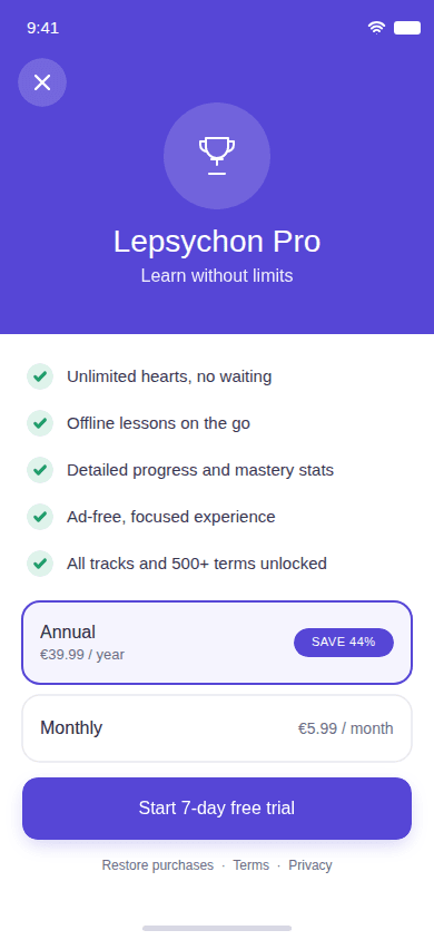
Pricing: the subscription screen for premium, designed alongside the rest of the system.
Impact
A design system spanning 30 screens per platform, with token and component specs precise enough that the build follows the file rather than reinterpreting it: exact frame sizes, a 4pt spacing grid, a fixed type scale with no half-pixel sizes, and per-component states for buttons, fields, quiz options, list rows and feedback sheets. The match-the-pairs board was deleted outright, the onboarding screen's lexicon figure was corrected, and the review flow was rebuilt around single-term grading. The most valuable outcome was catching the match-the-pairs problem in design rather than after the scheduler had been built against it.
The problem
People are curious about why they think, feel and behave the way they do, but the trustworthy material is locked in dense textbooks, scattered across blog posts of uneven quality, or sitting behind a course paywall. There was no way to learn psychology a little at a time, on a phone, from a source you could check.
Process
- 1
Defined the audience and the north star
Curious self-improvement readers aged 18–40, and students in intro psychology, nursing, social work and education. One north-star metric: weekly active learners completing at least one lesson.
- 2
Drew the boundaries before the screens
Explicit non-goals: not therapy, no diagnosis, no crisis features; not a social network; not a certification platform. Naming what the product refuses to be removed most of the ambiguity from the feature set.
- 3
Reasoned about the learner before drawing anything
Every screen started as a question about attention rather than layout: this person is on a phone, probably standing, with a few minutes and most of their working memory already spent elsewhere. That set the ceiling on what a screen may carry: one job, one primary action, and nothing the learner has to hold in their head while they go and do something else. The lesson loop is the product, so everything else was designed to cost less attention than it does.
- 4
Built the screen inventory
Thirty screens per platform across five groups (onboarding and auth, learn and lesson, lexicon and review, profile and settings, subscription and about), so the IA was settled before any visual design.
- 5
Prototyped all thirty screens in grey
The first full pass was greyscale boxes at real frame sizes: no type styles, no icons, no brand, no green. A hierarchy that only works because the correct answer is green is not a hierarchy, and in grey the screens carrying too much were obvious at a glance. Three were split and two were deleted at that stage, none of which had cost more than an hour. Colour went on last and only where it had a job, which is why no state in the app is carried by colour alone.
- 6
Grouped by Gestalt rather than by heading
Proximity and common region do the explaining: a lesson card, its progress and its action share one region and sit closer to each other than to anything else, so no row needs a label to say what it belongs to. Where I found myself writing such a label, the grouping was wrong and the layout got fixed instead. Controls that behave the same way are drawn the same way, with one radius, one shadow step and one colour logic across buttons, fields, quiz options and list rows, because a control that looks different is claiming to be different.
- 7
Made the design file the source of truth
The design system lives in one file, with a written token reference covering colour, type, shape, spacing and per-component specs. Where code and design disagree, design wins and the app follows.
- 8
Designed both platforms natively, not once and scaled
iOS and Android get their own frames, chrome, and vertical rhythm: arrow-back versus chevron, 32px versus 50px status bars, tighter Android content gaps. The same product, not the same pixels.
- 9
Audited against fixed accessibility invariants
Every tappable target at least 44×44pt, 8px minimum between adjacent targets, 4.5:1 text contrast with a named minimum ink value, never colour-only meaning, vector icons rather than emoji, one primary action per screen.
Design decisions
Each decision below carries the alternative it beat, and says what that alternative would have cost. They are not straw men: the rejected option is usually the conventional one, and often the one that was drawn, specified or already built first.
Review shows one term at a time
Spaced repetition only works if the grade fed to the scheduler reflects what the learner actually recalled. One term per answer produces an honest grade.
Rejected. Match-the-pairs, which had already been designed and was deleted. With four pairs on screen the last one falls out by elimination, so the grade sent to the scheduler would be a lie.
A review can never be failed
The review loop exists to build the habit of returning to things you have half-forgotten. It has to be safe to be wrong in.
Rejected. Carrying the lesson hearts system into review. Locking someone out for forgetting four things punishes exactly the behaviour the feature is designed to encourage. Hearts stay inside lessons, where failure is the point.
Deferred sign-up, then reversed to required sign-in
The original decision deferred the account so onboarding went straight into the first lesson. That was reversed five days later, once the shipped code and the approved scope were found to contradict each other. The deciding argument was the product's own promise that progress is never lost: an anonymous session lives only on-device, so a reinstall, a cache-clear or a device swap loses it. Required sign-in honours that promise from the first lesson onward; deferred sign-up worked against it.
Rejected. Keeping deferred sign-up. The reconciliation spec's own case against it: linking an anonymous session to a real account is fiddly and error-prone, it adds a prune job and an abuse surface for anonymous-only accounts, and the activation lift the original scope had projected did not justify that cost at pre-launch scale.
The lexicon advertises 150 terms
That is the number the product actually ships with, and the onboarding screen becomes an App Store screenshot seen by reviewers and prospective users.
Rejected. The 500 the screen originally claimed. A number that cannot be backed is a lie to the user and to the store reviewer, and it is the kind of claim that is trivially checked.
Account deletion is a first-class screen
App Store guideline 5.1.1(v) requires in-app account deletion the moment an app supports account creation, so it was designed into Settings rather than bolted on.
Rejected. Leaving deletion out of the app entirely, which is both an App Store rejection and a way of making the exit deliberately harder than the entrance.
Artifacts
primary.600#5A189A
The brand fill: primary buttons, the active unit card, the progress bar.
primary.400#9D4EDD
Focus ring. Non-text, so it is gated at 3:1 rather than 4.5:1.
primary.100#F3E1FF
Subtle brand fill: a selected quiz option, band surfaces.
ink.900#10002B
Headings.
ink.body#3C096C
Body copy.
ink.500#7B2CBF
Captions and muted text. 6.25:1 on the canvas.
ink.400#9D4EDD
Placeholder and disabled only, which WCAG 1.4.3 exempts. Never live text.
ink.200#F3E1FF
Borders.
surface#FFFFFF
Cards, sheets, and the auth and lesson screens.
canvas#EFE7F6
The app background.
success.base#136B48
A correct answer. Always paired with a mark, never colour alone.
error.base#B0353A
A wrong answer, and destructive actions.
amber.500#F59E0B
Streak and gem icons. Fill only; amber.text #8A5A08 is the text form, darkened for the purple canvas.
- radius input 12 · button 14 · card 16 · card lg 20 · sheet 24 · pill 999
- spacing 4pt grid
- type Golos Text 400 / 500 / 600 / 700 / 800
- touch target at least 44 × 44pt, 8px between adjacent
- frames iOS 390 × 844 · Android 360 × 800
packages/design-tokens/tokens.ts, the single source of truth for both platforms. Every value is gated by contrast.test.ts against the surface it actually renders on, in both themes; the light theme is shown.