Native app · accessibility audit · design system
BioSync
Product designer
An offline-first supplement cabinet: dose tracking, an on-device interaction rules engine, local reminders and barcode scanning. No backend, no account system, no analytics: every piece of state lives on the phone.
- Platform
- iOS and Android (Expo) · web (TanStack Start)
- Timeline
- 2026
- Status
- Mobile app in launch preparation
Screens
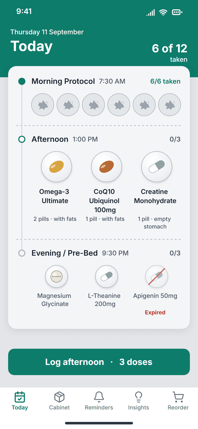
The day as a blister card: a taken dose leaves an emptied, torn cavity, so the state reads without colour. Supplement brands are invented; the stack and doses are the app’s seed data. 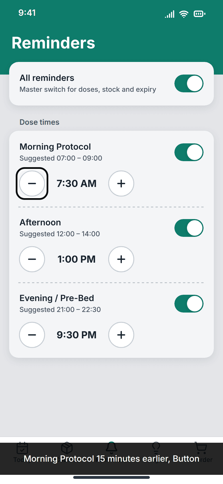
VoiceOver reads the icon-only button by its required label, “Morning Protocol 15 minutes earlier”, not as “minus”. The steppers are 44 points, the app’s own floor. 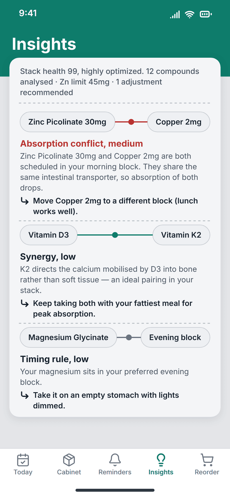
Each rule the on-device engine fires, drawn as a joined pair, with the engine’s own text. Nothing about the stack leaves the phone. 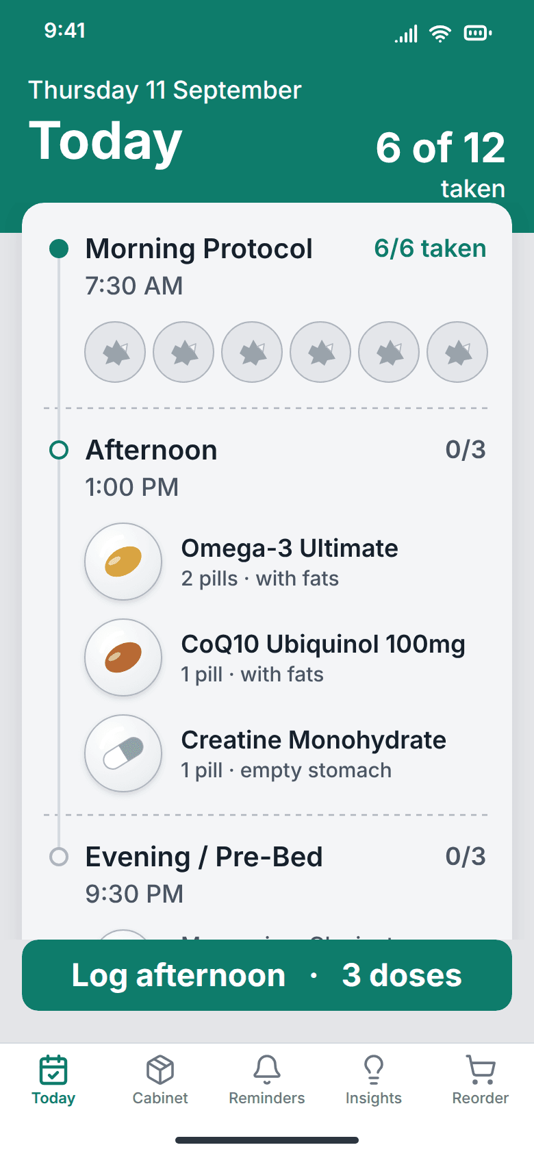
Today at the 135% cap: text grows, the grid becomes a list so nothing truncates, and the dose targets keep their size.
Impact
A native component library of twenty components, every one of them in use, carrying the same tokens as the web app by conversion rather than by eye. Five tab screens plus a scanner, a rules settings screen and a paywall. The accessibility problems found during the port are listed in the repository with what each one now does instead.
The problem
The web version was built on a component library of forty-six components, of which the application imported seven. Porting it to a phone was an opportunity to stop carrying the other thirty-nine. Opening each surviving component then turned it into an audit, which found the web interface was failing platform minimums that a browser had let it get away with.
Auditing a web library into a native one
- 1
Counted what was actually imported
Forty-six components in the library; seven used by the app. The rest (sidebar, menubar, carousel, command palette, chart, resizable panels) were scaffold left in place. The native library implements what the app used plus the primitives a phone needs: twenty components, all of them used.
- 2
Measured every interactive control against the platform floor
Apple and Google both publish minimum touch targets and minimum legible type sizes. Several controls in the web build were well under both: dose steppers at roughly 14px, a delete icon at 16px, time-block pills at 28px.
- 3
Checked what the interface announces, not only what it shows
Icon-only controls, toasts and the progress indicators were each opened from the perspective of a screen reader rather than a viewport. The score ring announced nothing usable.
- 4
Recorded the audit as a document, with the fixes
What was found, what carried over unchanged and what was deliberately changed, kept in the repository next to the code. An audit that is not written down is an opinion someone had once.
- 5
Looked for the object before looking for a layout
The shipped interface reads like every wellness app because it was designed as an app. So the question I asked instead was what this person is physically holding when they use it. The answer is a blister strip: a grid of doses where the ones you have taken are visibly gone, and you can see the rest of your day without counting anything. That is recognition doing the work recall was doing before, and it is a real-world metaphor rather than a decorative one, because the emptied cavity is genuinely the state, not a picture of it.
- 6
Drew it in grey, which is where the colour rule came from
The redesign was drawn without colour first. In grey a ring at 50% and a ring at 80% are the same ring, and a green tick and a red cross are the same mark, so anything that survived the grey pass was carrying its state in shape or in words. That is why a taken dose is a torn, emptied cavity and an expired one is struck through, rather than either of them being a hue. The accessibility rule and the visual idea arrived together; neither was retrofitted onto the other.
- 7
Redesigned the day as a blister card
The shipped interface reads like every wellness app: rings, streak flames, glowing buttons. The redesign is a design file, not yet in the build. It keeps the stack, the rules engine and every accessibility rule, and draws the day as the thing people actually hold: a blister card where each dose sits in its dome and a taken dose leaves an emptied cavity.
What the audit changed
Each decision below carries the alternative it beat, and says what that alternative would have cost. They are not straw men: the rejected option is usually the conventional one, and often the one that was drawn, specified or already built first.
The icon button makes its label a required property
In the web build, naming an icon-only control was a convention each call site had to remember. In the native library it is a required property: an icon-only control with no accessible name cannot be constructed, because the type system refuses it.
Rejected. A lint rule or a review checklist, both of which rely on somebody noticing. Making the wrong thing impossible to express beats catching it afterwards.
The bottom of the type ramp moved up, and the hierarchy did not
The native ramp starts at 11pt, which is the platform floor, and most of what had been 10px moved to 12pt. Relative hierarchy is unchanged; only the floor moved.
Rejected. Scaling the whole ramp up, which would have preserved the same relationships while making every screen hold less.
Every interactive primitive resolves its own minimum size
A single constant resolves to 44 on iOS and 48 on Android, and every primitive uses it by default; the two 40-point controls, the reminder time steppers and the sheet's close button, reach the minimum through hit slop. Touchable controls add hit slop on top of that.
Rejected. Setting sizes per component as they were built, which is how the web version ended up with a 14px stepper next to a 44px button.
The score ring is one node, not a drawing
It is a single progress element that announces its label and value, "taken: 50 percent" on Today. The web version was bare vector shapes with a separate percentage beside them.
Rejected. Adding a visually hidden text label beside it, which fixes the announcement while leaving two things that can disagree.
Font scaling is honoured, and clamped
The text component respects the operating system setting but bounds the multiplier. Nothing constrained it before, and at 200% the fixed-height rows and pill badges broke. The tab bar labels are the one exception.
Rejected. Passing the multiplier through unbounded, which is the accessible-sounding option right up to the point where the layout it produces is unusable.
No backend, no account, no analytics
All state is on the device. The only outbound requests are to the app store's purchase service, which checks and sells the paid tier, and the merchant pages the user opens. No supplement or dose data leaves the phone.
Rejected. Cloud sync with accounts, which for a product holding supplement and dosage records means acquiring health data nobody asked us to hold.
Artifacts
emerald#10B981
Primary. The log action, a taken dose, and a synergy between two supplements.
cyan#06B6D4
Informational rules and neutral highlights.
amber#F59E0B
A timing rule, and a dose that is due.
crimson#EF4444
An absorption conflict, an expired dose, and destructive actions.
background#0B0F17
The app ground.
surface / card#121824
Cards, and the blister sheet the day is drawn on.
surfaceElevated#1B212B
Anything floating above a card: sheets, menus, the scanner overlay.
foreground#F3F6FA
All copy.
mutedForeground#9199A5
Captions and secondary copy.
border#282E38
Card and control boundaries.
onAccent#0B0F17
Text sitting on an emerald or crimson fill. It exists so no call site guesses white.
- radius sm 12 · md 14 · lg 16 · xl 20 · 2xl 24 · 3xl 28 · full 999
- spacing 4pt grid, 4 to 40
- type 11 / 12 / 13 / 14 / 16 / 20 / 28, floor at the platform minimum
- touch target 44 iOS · 48 Android, resolved by one constant
- text scaling honoured and clamped at 135%
- motion fast 150 · base 240 · slow 600, all skipped under Reduce Motion
mobile/src/ui/theme.ts, the native counterpart of the web app’s stylesheet. The brand colours keep their canonical hex values and the neutrals are sRGB conversions of the original oklch ramp, so both platforms render the same interface by conversion rather than by eye. These are the SHIPPED values, which is why they do not match the screens above: the redesign leaves the dark ground behind and works on a light sheet under a deep green header, and it is a design file rather than a build.