Personal finance · cross-platform product design
Monaze Money
Product designer
A cross-platform personal finance manager for people who lost Mint and people still on Quicken for its forecasting. Accounts, transactions, transfers, categories, budgets and reconciliation, entered by hand, with no bank connection. Forecasting is specified and next. Web and desktop today, from one domain model, and the phone screens in this study are the designed proposal for the native app, targeting Expo over those same shared packages.
- Platform
- Web (Next.js) · desktop (Electron shell around the web app)
- Timeline
- 2026
- Status
- In build: foundation, ledger and the first tracker phase landed
Screens
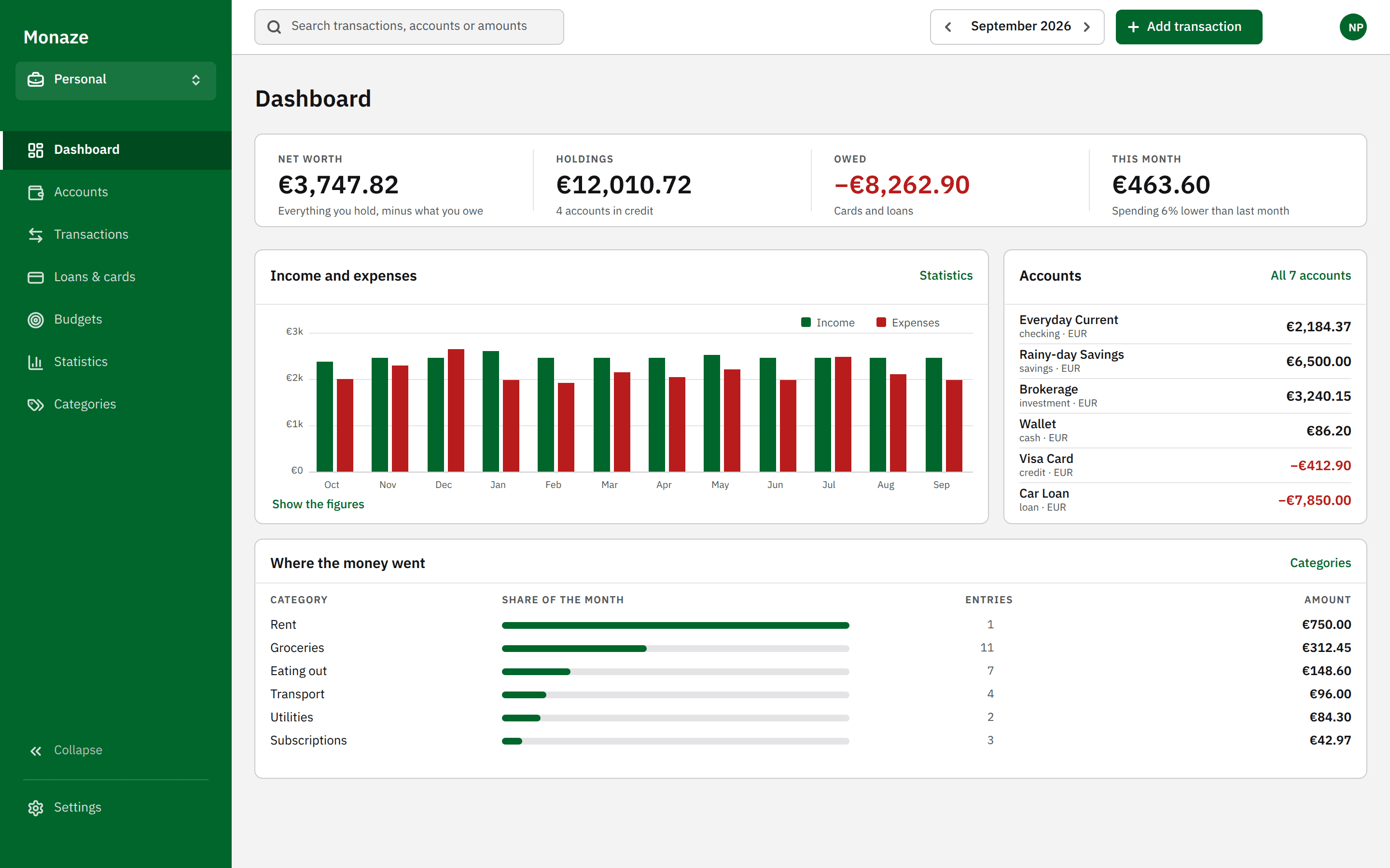
The dashboard in the vocabulary its users already own from small-business accounting: one bordered figure band rather than four floating tiles, and the month’s spending ranked by category, each share drawn beside the amount it stands for. 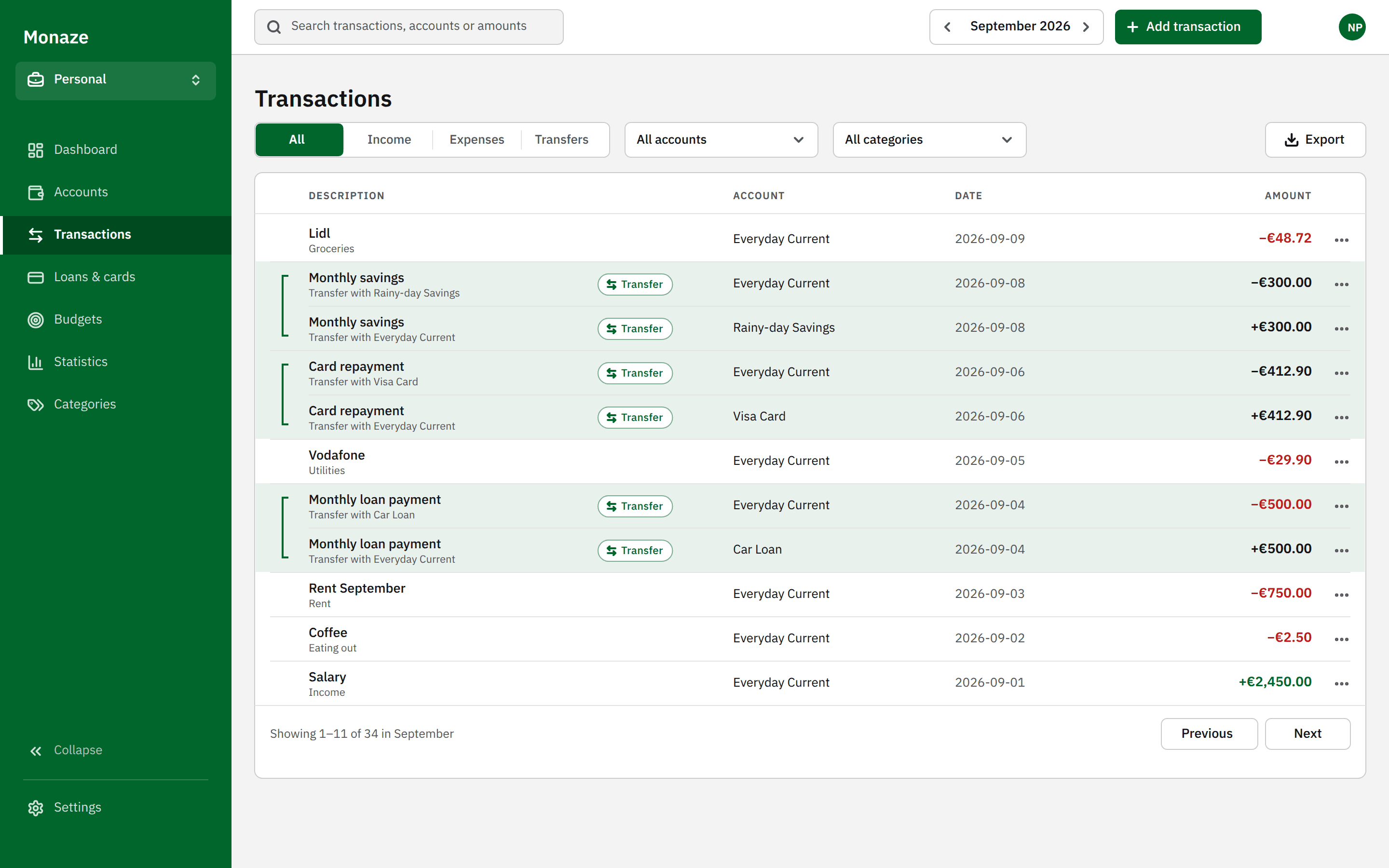
A transfer is two rows, so the table shows two rows and draws the bracket that says they are one event. The legs are set in ink rather than green, because money moved between your own accounts is not income. 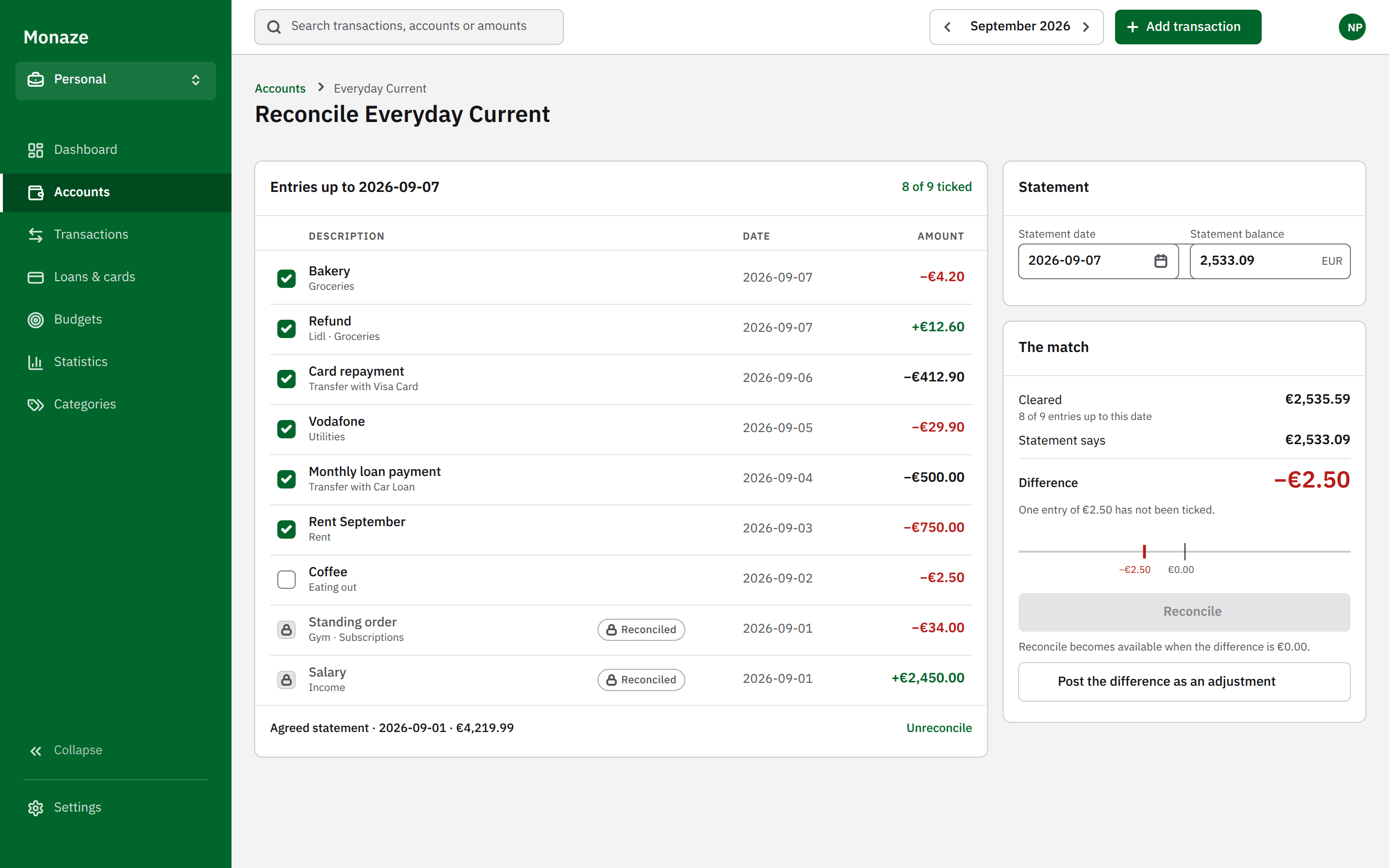
Reconcile keeps the app’s own words and reads the difference against a fixed zero. The primary action stays disabled until that difference is €0.00, and a reconciled entry is marked by a padlock and the word, never by colour alone.
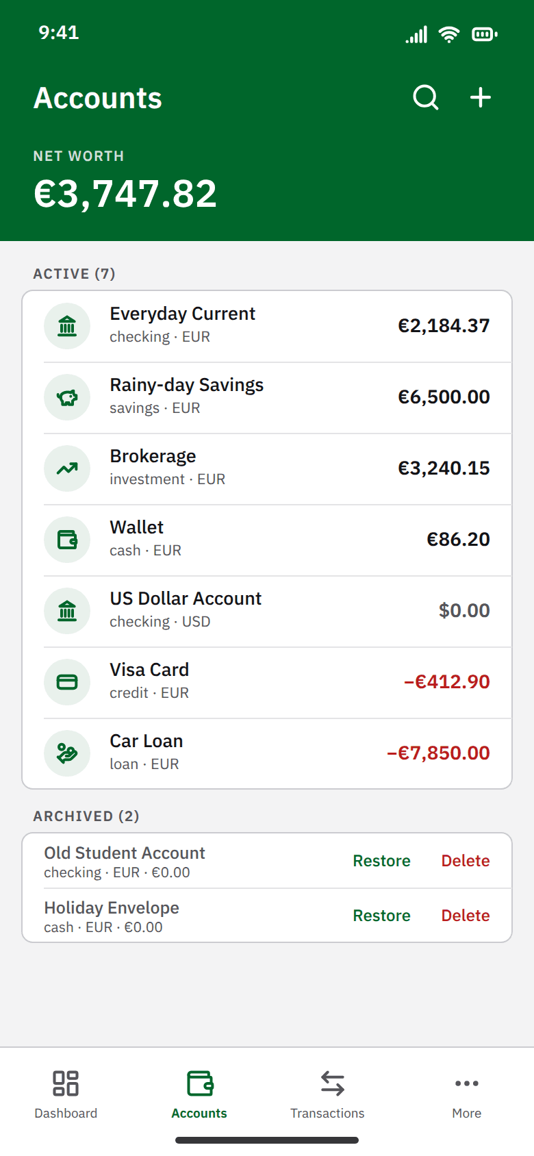
Monaze ships on web and in an Electron shell, so the phone screens design the native interface the platform decision describes. An active account offers Archive and no Delete; Delete appears only once an account holds nothing. 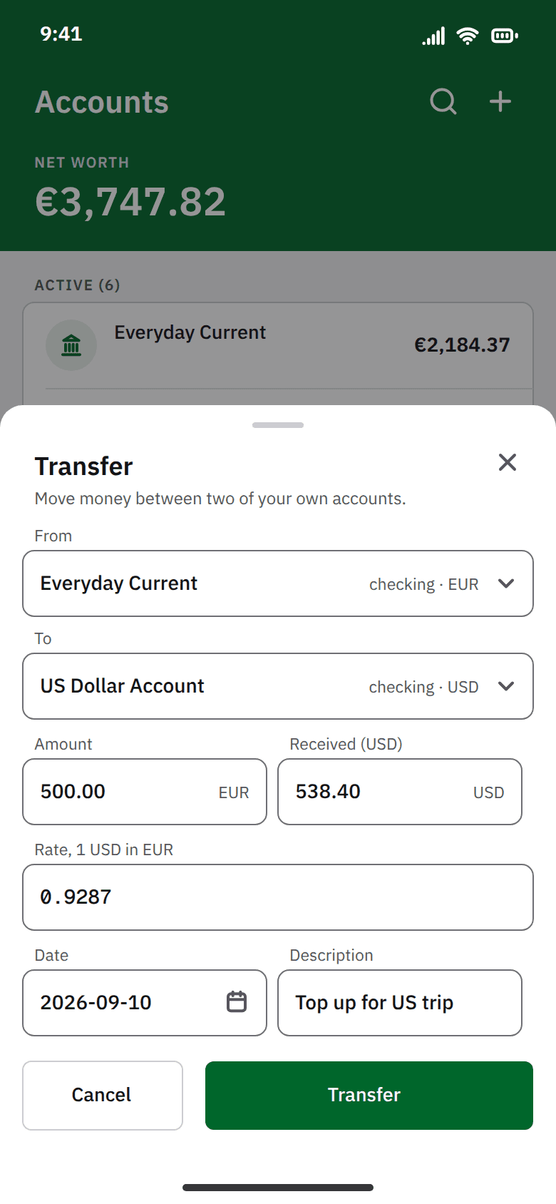
Sent and received are two fields rather than one amount and a rate, because the spread means no rate reproduces the second from the first, and the rate is kept as typed, so totals never move when rates change later.
Impact
A ledger that holds accounts of seven types, integer-minor-unit transactions, two-legged transfers, computed balances, categories, monthly budgets, statistics, loans, credit cards, receivables, multi-currency and reconciliation, with idempotent import through a developer script. Payees, rules, splits, recurring series and balance projection are specified to extend it additively. Ten screens ship on web, inside an Electron shell on desktop.
The problem
Personal finance apps fail in ways their users describe precisely and repeatedly, and almost none of those failures are cosmetic. The category is full of products that model money as a floating-point number, treat a transfer between your own accounts as spending, and store a balance that can quietly disagree with the transactions underneath it. Building another one without first establishing which complaints are structural would have meant reproducing them.
How the product got its shape
- 1
Read the category instead of surveying it
The research input was 17,804 posts and 14,882 comments across 25 personal finance subreddits, January 2024 to August 2026. The point was not sentiment but recurrence: which complaints show up against every incumbent, which are specific to one product, and which are structural rather than a matter of preference.
- 2
Chose a population rather than a feature list
The research surfaced two large displaced groups: people who lost Mint, and people who stay on Quicken specifically for forecasting. Monaze targets those two. It does not compete with YNAB and Actual Budget on zero-based envelope mechanics, which is a different product for a different person.
- 3
Decomposed the product before specifying any of it
The product was split into sub-projects, each to get its own spec and implementation cycle; three are specified so far: foundation, ledger, and tracking with forecasting. A single specification for the whole product would have been too large to hold, and too large to change.
- 4
Proved the integrations before building on them
The foundation sub-project was scoped to retire three risks: identity tokens authorising database row-level security, a monorepo whose shared packages must resolve under two different bundlers, and a desktop shell holding a session. It shipped one authenticated screen on web and desktop. The mobile app and the production sign-in provider were deferred, so the bundler risk and the identity-provider half of the first risk are still open. Discovering an integration problem after writing features on top of it is the expensive version of the same week.
- 5
Borrowed a vocabulary the users already owned
The shipped ledger was correct and unreadable, and the reason was not styling: it had no vocabulary. Rather than invent one, I asked what this audience already reads fluently. They are people who have kept books (invoices, statements, a ledger that balances), so the interface borrows that language instead of teaching a new one. A green rail you work from, a white sheet you work on, and every screen ending in one action that either balances or does not. Borrowing a mental model the reader already has is the cheapest thing a design can do; building a new one is the most expensive.
- 6
Tested the hierarchy in grey before spending any colour
The redesign was drawn in greyscale first, at 1440x900 and 390x844. It is the only honest way to check a finance interface, because money is the one domain where colour is load-bearing, and if a screen only works when the negative number is red, then nothing on it has a hierarchy. Colour went back on last and stayed rationed: green promoted from an amount colour to the brand, red spent only on amounts, and every state marked by a word, a padlock or a chip as well as a hue.
- 7
Redesigned the ledger as bookkeeping software
The shipped web app is deliberately black and white, with green and red spent only on amounts, and the result gives a nav item, a heading and a €7,850 debt the same weight. The redesign is a design file, not yet in the build: it keeps the model, the figures and the product’s own words, and changes only what outranks what. The two phone screens go further than that. Monaze has no mobile app, so they are a proposal for the native interface the platform decision describes.
Decisions that set the model
Each decision below carries the alternative it beat, and says what that alternative would have cost. They are not straw men: the rejected option is usually the conventional one, and often the one that was drawn, specified or already built first.
A transfer is two rows, not one
Moving money between your own accounts writes two linked rows sharing a transfer id. Every balance stays a plain sum of one account’s own rows, and no later feature has to know what a transfer is.
Rejected. One row carrying a source and a destination account. Simpler to insert, but every balance query becomes a conditional sum across two columns, and budgets, category totals and insights each have to special-case transfers permanently.
Balances are computed on read, never stored
A balance is a view over the transactions that produce it, so it cannot drift from them. There is no code keeping a stored balance in step with its transactions, and none to debug.
Rejected. A stored balance maintained by a database trigger. Faster reads, but two sources of truth that can diverge, and a bad migration or a trigger bug leaves a wrong number on screen with nothing in the system able to detect it.
Money is an integer in minor units
Amounts are stored as whole minor units: cents for the euro, and each currency's own exponent otherwise. Binary floating point cannot represent a decimal balance exactly, and a finance product that rounds is a finance product nobody can reconcile against a bank statement.
Rejected. A decimal or float money type, which is the default in most schema tooling and the source of the rounding complaints the research found against several incumbents.
Shared logic, native UI per platform
The domain layer (money arithmetic, types and data access) lives in shared packages, and each platform is meant to draw its own interface. Today only the web app draws one, and the desktop app wraps it, so the rule has not yet been tested by a second interface.
Rejected. A single shared UI layer across web and native. Maximum reuse, but it forfeits the web component library, produces poor web semantics, and its tooling is fragile at the current framework edge.
Deleting an account archives it
Financial history is the one thing a user cannot reconstruct. An account is archived by default, and hard deletion is available only when it holds nothing.
Rejected. A conventional delete with a confirmation dialog, which is a warning, not a safeguard, and puts an irreversible action one mis-click away.
Multi-currency before real data exists
Currency changes what an amount means to every aggregate in the schema. Introducing it while the database is empty is cheap.
Rejected. Adding it later once users exist, which turns the same change into a data migration across every money column in the system.
Artifacts
--color-positive#00662b
Money in. One of only two colours in the entire app.
--destructive#b91c1c
Money out, delete and cancel. The other one.
--background#f3f3f4
The page. Soft white rather than pure white, which glares over a long session.
--card#e4e4e6
Cards. Card and ground move together: change one alone and the layout flattens into a single sheet.
--popover#ffffff
Dialogs and dropdowns. The only pure white in the light theme, which is what makes them read as nearer.
--foreground#131316
All copy.
--primary#131316
Primary action, focus ring and active nav. Near-black, because the brand is deliberately not a colour.
--muted-foreground#55555a
Secondary copy and column headers.
--border#cbcbd0
Decorative hairline only. Nowhere near the 3:1 WCAG 1.4.11 wants for a control boundary.
--input#6f6f75
Every bordered control, which is exactly why it exists separately from the border.
- radius 8px, everywhere
- spacing 4 / 8 / 12 / 16 / 24 / 32 / 48
- row height 36px desktop · 48px mobile, the touch floor
- shell sidebar 240 · header 56 · bottom nav 64
- frames web 1440 × 900 · phone 390 × 844
apps/web/src/app/tokens.css. Checked by `pnpm --filter web contrast`, which resolves the var() chains and tests all 25 pairs against WCAG 2.2 AA in both themes; the light theme is shown. The redesign in this study promotes the green from an amount colour to the brand, which is a change it makes and the shipped app does not.